
New Plans for "City Center" Uninspiring and Underwhelming
Submitted by on Wed, 07/07/2010 - 11:50am
by Scott Schrantz Source: http://aroundcarson.com/2010/07/07/new_plans_for_city_center_uninspiring_and_underwhelming Last week a few preliminary designs for the downtown renovation project, formerly known as the "Nugget Economic Development Project", were unveiled. I hesitated to comment on them because normally I like to keeps things positive, I don't want to say anything bad. But these plans just leave me feeling cold all over and I can't stay quiet. This project is at a fork where it could either be really successful, or a fall-down flop. And they seem to be heading toward the road to Flopville.First is the name. I didn't think it was possible to come up with a worse name than "Nugget Economic Development Project", but they did: "Carson City Center". It's a blah name that evokes a thousand other generic early century redevelopment projects, and in Nevada it's already associated with both a theme-free mega resort in Las Vegas, and a motel that's just two blocks away from the Nugget. Strip mall developers are able to come up with better names than this, and these people should be able to too if they spent more than 30 seconds on it.But even worse are the designs that they put forward for the layout of the project. There are three different "designs", which it looks like they developed by having a two-year old move Legos around a board. All three designs are centered around tall, monolithic buildings separated by wide streets, and they vary only in the actual placement of the buildings. Like in grade school when you would have little paper cut outs of a couch, TV, and easy chairs, and use them to pretend to arrange furniture in your house. There's not a single thing about any of these designs that makes me think, "Hey, I want to go there." Instead I look at them and say, "How dreadful." Let's break them down.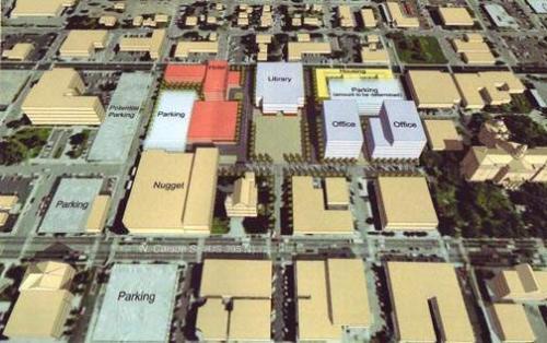 We'll start off not with the "best"; let's call it the least bad. This design typifies much of the uninspired sameness that designers P3 Development were able to come up with. The eight block area is still split up into roughly 8 blocks, but at least in this design things are offset a little bit; that's what makes it the least bad. But it's still replacing street grid with street grid, replacing square parking lots with square buildings. This is not what we want to do. Points do go to this one for the large grassy area in front of the library. Some kind of park like setting is essential for this project. I also like the offset, and how Telegraph Street leads right into the front door of the library. I've said that Telegraph is the key to whatever gets built on this space, and should be treated as the entryway to this project from Carson Street. Putting the library here serves as a "weenie" to pull people in from the main street.
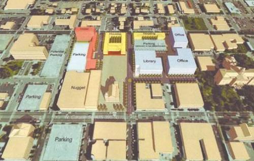 Between this design and the last one we're kind of skirting around a few good ideas that need to be explored more. This one loses the offset that I like, but it does incorporate the grassy area into the grounds of the Laxalt Building. Double extra points for recognizing Laxalt as one of the most awesome buildings downtown, and trying to incorporate it. They're just not doing it enough.This one loses points, though, for relocating the library away from the park and shoving it into an office building. Housing takes the place of prominence at the far end of the park, which I don't think is the right way to go. In fact, all these designs have the housing as a separate Lego piece that keeps getting shoehorned into whatever empty space is left over. I think that's the wrong way to go, and if you want to reach for a true urban feel you need to make the housing more integrated. Like retail on the ground floor with residential above. People making a conscious choice to live downtown probably don't want to live in a Soviet style housing block.
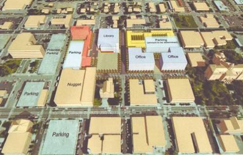 Again, it's like they're shooting darts blindfolded and they just can't hit the bullseye. The library is back in the grassy area, but the Laxalt Building is disconnected again, and the offset is gone, making Telegraph a through street. This brings up one of the biggest problems I have with these designs; they're too car-heavy. Nobody drives through this part of town now unless they're looking for a parking space at the Nugget or the Capitol complex. And these plans do involve parking garages at either end, which is necessary if you're removing this much parking from the town, and expecting even more people to come to the area. But with the parking gone, the need for wide streets is gone too. And I would argue that there is no need for cars in this project at all.We have a chance here to do something truly different, to tear out several blocks of existing street grid and start over. If we want to make this a destination we need to make it attractive, and that means making it walkable, making it human scale. There shouldn't be straight lines, there should be meandering spaces that pull you in. There shouldn't be narrow streets "so that sidewalks could be widened". There should be no streets at all. I know it's a radical concept, but maybe if people have to walk around this neighborhood they'll be more engaged with it and spend more time and money here.I could be approaching this from the wrong angle, but I'm looking at this as a tourist destination as well as a downtown core. We want people to come to Carson City, and we want them to go downtown and not be disappointed. I think about all the towns I've been to, all the tourist areas, and nearly all of them involve getting out of your car and exploring on foot. Old Sacramento has tons of interesting shops and restaurants, and you really can't get a feel for the place unless you get out and walk. Car traffic is allowed here, but pedestrians definitely have the right of way. In Seattle the Pike Place Market and Seattle Center (home of the Space Needle) are large public areas, one a shopping center and the other a park, where you have to park your car and go by foot. San Francisco's Fisherman's Wharf is another area that packs in the tourists, and you have to walk to get to it. Carson City could also learn something from theme park design, places that are specifically built to be people magnets. Right next door to Disneyland is the Downtown Disney shopping district, an outdoor mall that's entirely pedestrian. Also in Southern California is Universal's City Walk, a large area with movie theaters and shops and restaurants that people can go to and make a whole evening out of. Carson City doesn't have enough people to do anything on that kind of scale, but a smaller version of those places is what we should be looking at. Closer to home we have Heavenly Village at South Lake Tahoe, another prototype that Carson City should be trying to mimic.Give people a reason to come downtown, give them something to do. make them feel like they can come down and spend five or six hours without getting bored, and this project will be a success. Making it a bunch of disparate parts that have no connection to each other, which is what these designs do, is a sure way to see the project fail. I just hope everyone wakes up and notices this before we go too far down the wrong path.Look back at my post "Future of Downtown" from a few years ago for more complaints/hopes about Carson City's future.
- Carson City
- Bad
- Buildings
- Buildings.
- California
- Capitol
- car
- cars
- carson
- Carson Street
- center
- City
- Development
- Disney
- DO SOMETHING!
- downtown
- Economic Development
- Furniture
- Ground Floor
- home
- hope
- Hours
- Housing
- Lake
- learn
- live
- Market
- money
- Movie
- need
- Nevada
- new
- nugget
- outdoor
- Pedestrian
- positive
- POST
- public
- Redevelopment
- Renovation Project
- restaurants
- school
- Shooting
- shopping
- south
- South Lake Tahoe
- Space
- tahoe
- walk
- Lake Tahoe
- Las Vegas
- Library
- Traffic


